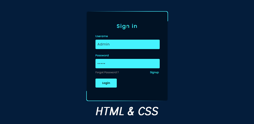
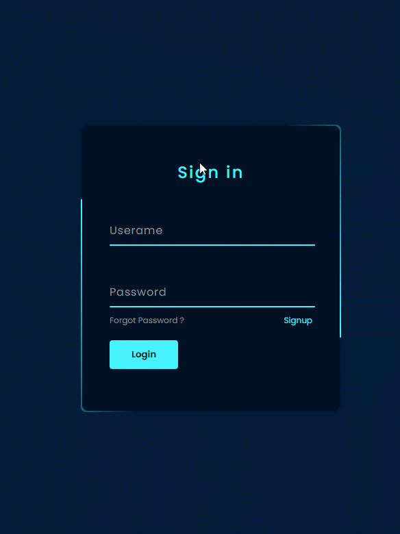
Hi Everyone, this article shows you how to create an animated login form using HTML with CSS—this source code is from Online Tutorials.
HTML Contents:
1. Create an index.html
Create an HTML file’s name as an index that has an extension (.html) and write the below code for creating a login form interface having a title, username box, password box, forget password link, sign up link, and a login button.
<!DOCTYPE html>
<html lang="en">
<head>
	<meta charset="UTF-8">
	<title>Login Form</title>
</head>
<body>
	<div class="box">
		<form autocomplete="off">
			<h2>Sign in</h2>
			<div class="inputBox">
				<input type="text" required="required">
				<span>Userame</span>
				<i></i>
			</div>
			<div class="inputBox">
				<input type="password" required="required">
				<span>Password</span>
				<i></i>
			</div>
			<div class="links">
				<a href="#">Forgot Password ?</a>
				<a href="#">Signup</a>
			</div>
			<input type="submit" value="Login">
		</form>
	</div>
</body>
</html>
2. CSS code in StyleSheet tag
	<style>
		@import url('https://fonts.googleapis.com/css2?family=Poppins:wght@300;400;500;600;700;800;900&display=swap');
		*
		{
			margin: 0;
			padding: 0;
			box-sizing: border-box;
		font-family: 'Poppins', sans-serif;
		}
		body
		{
			display: flex;
			justify-content: center;
			align-items: center;
			min-height: 100vh;
			flex-direction: column;
			background: #0368db;
		}
		.box
		{
			position: relative;
			width: 380px;
			height: 420px;
			background: #1c1c1c;
			border-radius: 8px;
			overflow: hidden;
		}
		.box::before
		{
			content: '';
			z-index: 1;
			position: absolute;
			top: -50%;
			left: -50%;
			width: 380px;
			height: 420px;
			transform-origin: bottom right;
			background: linear-gradient(0deg,transparent,#45f3ff,#45f3ff);
			animation: animate 6s linear infinite;
		}
		.box::after
		{
			content: '';
			z-index: 1;
			position: absolute;
			top: -50%;
			left: -50%;
			width: 380px;
			height: 420px;
			transform-origin: bottom right;
			background: linear-gradient(0deg,transparent,#45f3ff,#45f3ff);
			animation: animate 6s linear infinite;
			animation-delay: -3s;
		}
		@keyframes animate
		{
			0%
			{
				transform: rotate(0deg);
			}
			100%
			{
				transform: rotate(360deg);
			}
		}
		form
		{
			position: absolute;
			inset: 2px;
			background: #28292d;
			padding: 50px 40px;
			border-radius: 8px;
			z-index: 2;
			display: flex;
			flex-direction: column;
		}
		h2
		{
			color: #45f3ff;
			font-weight: 500;
			text-align: center;
			letter-spacing: 0.1em;
		}
		.inputBox
		{
			position: relative;
			width: 300px;
			margin-top: 35px;
		}
		.inputBox input
		{
			position: relative;
			width: 100%;
			padding: 20px 10px 10px;
			background: transparent;
			outline: none;
			box-shadow: none;
			border: none;
			color: #23242a;
			font-size: 1em;
			letter-spacing: 0.05em;
			transition: 0.5s;
			z-index: 10;
		}
		.inputBox span
		{
			position: absolute;
			left: 0;
			padding: 20px 0px 10px;
			pointer-events: none;
			font-size: 1em;
			color: #8f8f8f;
			letter-spacing: 0.05em;
			transition: 0.5s;
		}
		.inputBox input:valid ~ span,
		.inputBox input:focus ~ span
		{
			color: #45f3ff;
			transform: translateX(0px) translateY(-34px);
			font-size: 0.75em;
		}
		.inputBox i
		{
			position: absolute;
			left: 0;
			bottom: 0;
			width: 100%;
			height: 2px;
			background: #45f3ff;
			border-radius: 4px;
			overflow: hidden;
			transition: 0.5s;
			pointer-events: none;
			z-index: 9;
		}
		.inputBox input:valid ~ i,
		.inputBox input:focus ~ i
		{
			height: 44px;
		}
		.links
		{
			display: flex;
			justify-content: space-between;
		}
		.links a
		{
			margin: 10px 0;
			font-size: 0.75em;
			color: #8f8f8f;
			text-decoration: beige;
		}
		.links a:hover,
		.links a:nth-child(2)
		{
			color: #45f3ff;
		}
		input[type="submit"]
		{
			border: none;
			outline: none;
			padding: 11px 25px;
			background: #45f3ff;
			cursor: pointer;
			border-radius: 4px;
			font-weight: 600;
			width: 100px;
			margin-top: 10px;
		}
		input[type="submit"]:active
		{
			opacity: 0.8;
		}
	</style>
3. The following code snippet is complete code that mixes HTML with CSS
After creating an index.html, you can add StyleSheet to the HTML header tag. But if you want to split CSS code from HTML code, you can create a CSS file (*.css) and include it with this line
<link rel="stylesheet" href="style.css">But for this example, they were combined into a file not split. So the following code snippet is complete code in an HTML file
<!DOCTYPE html>
<html lang="en">
<head>
	<meta charset="UTF-8">
	<title>Login Form</title>
	<style>
		@import url('https://fonts.googleapis.com/css2?family=Poppins:wght@300;400;500;600;700;800;900&display=swap');
		*
		{
			margin: 0;
			padding: 0;
			box-sizing: border-box;
		font-family: 'Poppins', sans-serif;
		}
		body
		{
			display: flex;
			justify-content: center;
			align-items: center;
			min-height: 100vh;
			flex-direction: column;
			background: #0368db;
		}
		.box
		{
			position: relative;
			width: 380px;
			height: 420px;
			background: #1c1c1c;
			border-radius: 8px;
			overflow: hidden;
		}
		.box::before
		{
			content: '';
			z-index: 1;
			position: absolute;
			top: -50%;
			left: -50%;
			width: 380px;
			height: 420px;
			transform-origin: bottom right;
			background: linear-gradient(0deg,transparent,#45f3ff,#45f3ff);
			animation: animate 6s linear infinite;
		}
		.box::after
		{
			content: '';
			z-index: 1;
			position: absolute;
			top: -50%;
			left: -50%;
			width: 380px;
			height: 420px;
			transform-origin: bottom right;
			background: linear-gradient(0deg,transparent,#45f3ff,#45f3ff);
			animation: animate 6s linear infinite;
			animation-delay: -3s;
		}
		@keyframes animate
		{
			0%
			{
				transform: rotate(0deg);
			}
			100%
			{
				transform: rotate(360deg);
			}
		}
		form
		{
			position: absolute;
			inset: 2px;
			background: #28292d;
			padding: 50px 40px;
			border-radius: 8px;
			z-index: 2;
			display: flex;
			flex-direction: column;
		}
		h2
		{
			color: #45f3ff;
			font-weight: 500;
			text-align: center;
			letter-spacing: 0.1em;
		}
		.inputBox
		{
			position: relative;
			width: 300px;
			margin-top: 35px;
		}
		.inputBox input
		{
			position: relative;
			width: 100%;
			padding: 20px 10px 10px;
			background: transparent;
			outline: none;
			box-shadow: none;
			border: none;
			color: #23242a;
			font-size: 1em;
			letter-spacing: 0.05em;
			transition: 0.5s;
			z-index: 10;
		}
		.inputBox span
		{
			position: absolute;
			left: 0;
			padding: 20px 0px 10px;
			pointer-events: none;
			font-size: 1em;
			color: #8f8f8f;
			letter-spacing: 0.05em;
			transition: 0.5s;
		}
		.inputBox input:valid ~ span,
		.inputBox input:focus ~ span
		{
			color: #45f3ff;
			transform: translateX(0px) translateY(-34px);
			font-size: 0.75em;
		}
		.inputBox i
		{
			position: absolute;
			left: 0;
			bottom: 0;
			width: 100%;
			height: 2px;
			background: #45f3ff;
			border-radius: 4px;
			overflow: hidden;
			transition: 0.5s;
			pointer-events: none;
			z-index: 9;
		}
		.inputBox input:valid ~ i,
		.inputBox input:focus ~ i
		{
			height: 44px;
		}
		.links
		{
			display: flex;
			justify-content: space-between;
		}
		.links a
		{
			margin: 10px 0;
			font-size: 0.75em;
			color: #8f8f8f;
			text-decoration: beige;
		}
		.links a:hover,
		.links a:nth-child(2)
		{
			color: #45f3ff;
		}
		input[type="submit"]
		{
			border: none;
			outline: none;
			padding: 11px 25px;
			background: #45f3ff;
			cursor: pointer;
			border-radius: 4px;
			font-weight: 600;
			width: 100px;
			margin-top: 10px;
		}
		input[type="submit"]:active
		{
			opacity: 0.8;
		}
	</style>
</head>
<body>
	<div class="box">
		<form autocomplete="off">
			<h2>Sign in</h2>
			<div class="inputBox">
				<input type="text" required="required">
				<span>Userame</span>
				<i></i>
			</div>
			<div class="inputBox">
				<input type="password" required="required">
				<span>Password</span>
				<i></i>
			</div>
			<div class="links">
				<a href="#">Forgot Password ?</a>
				<a href="#">Signup</a>
			</div>
			<input type="submit" value="Login">
		</form>
	</div>
</body>
</html>
Final Result:
Tutorials Video by Online Tutorials